Vendeazie
A vendor-management tool for wedding professionals
Client Brief - Mobile App
Project Timeline
80 hours, 4 weeks
Client liaison, User research, competitor analysis, concept ideation, product and user goals, user flows, branding, UI design, prototyping, user testing, ideation prioritization.
My Role
Client’s existing research (and first-hand experience) discovered that wedding vendors lack the tools to keep contacts organized while networking at busy events, resulting in frustrations around social media management and sharing content to help boost each others’ businesses.
The Problem
Build a tool centered around the user’s need to capture fellow wedding vendors’ contact information quickly and intuitively, as well as the ability to easily recall the information when promoting content on social media later on.
The Solution
Uncovering Insights through User Interviews
Working with my client’s existing competitor research, I set out to validate her hypotheses and uncover even more insights through User Interviews before moving on with the design phase.
Understand how people currently give credit to other vendors when sharing content on social media
Understand the role that crediting sources plays in the success of people’s businesses. What are the benefits?
Understand approaches that people take to organize event and vendor information
Understand what success looks like to the user. How would it make them feel?
Research Objectives:
Users ranging in ages from 25-45
Range of vendor types; florists, planners, cake designers, photographers, event rentals, etc.
Users whose primary job/source of income comes from participating in weddings
Talked to:
With the feedback and insights I gathered from conducting these interviews, I was able to better understand what people need in order to successfully organize vendor information and share events on social media. In addition to hearing people’s stories and learning more about their lives, I gained valuable insights on how I might structure my design later on. I decided to create three User Stories that best supported my research findings, my client’s initial hypotheses and their existing user archetypes.
Research Findings
“I am not a very organized person- I currently have to look in a million different places to figure out who else worked on a wedding with me so that I can remember to tag them on social media.”
As a user, I want to find tools that work for my business so that I can boost my business and acquire new clients.
As a user, I want to learn how to utilize social media specifically for my business so that I can focus on the more meaningful/fun aspects of my job.
As a user, I want to network with my peers and fellow vendors so that I can boost my business and acquire new clients.
User Stories:
Defining the Project Goals
Utilizing Various Methods to Build a Strong IA
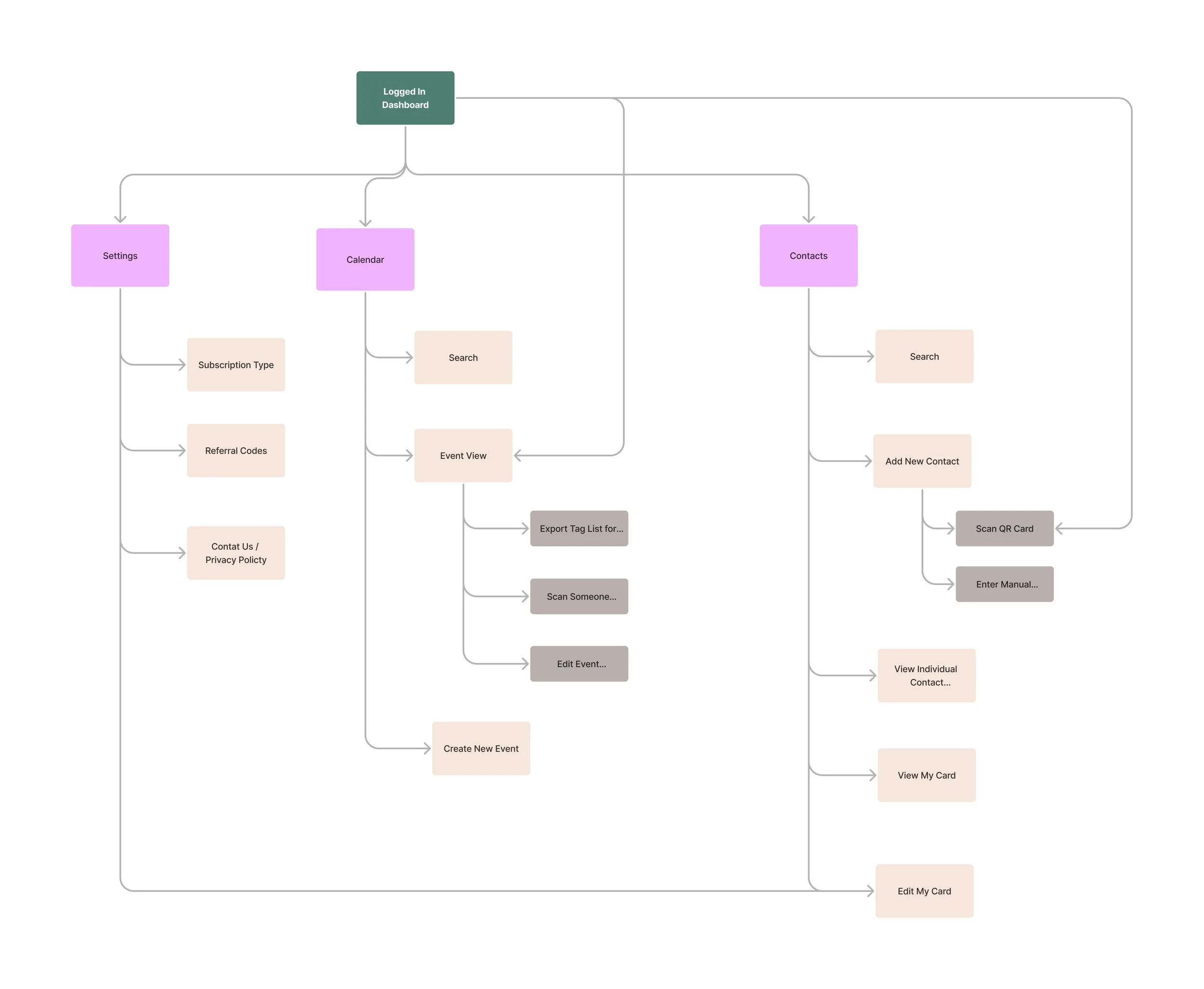
I initially used a closed card sort exercise to help inform how I structured the information and pages for the MVP. The card sort showed me that I need to consider multiple points of access for some of the features and tasks my users will need to execute.
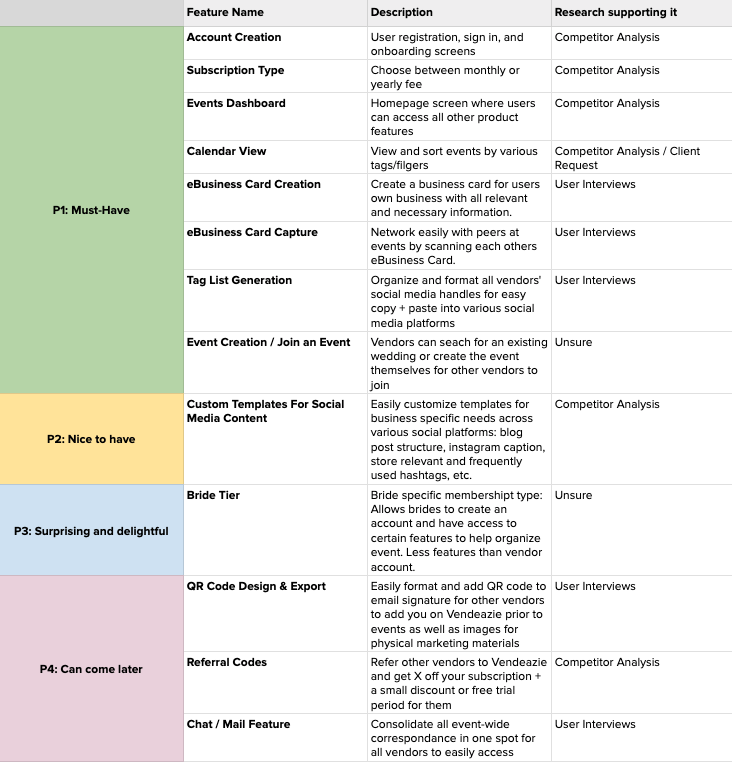
Next, I prioritized the flows and features that would best support the business goals, and would give my users the best overall experience of my MVP.
I chose to prioritize this user flow as part of my MVP because it carries out one of the main functions of my product. Supported by my user interviews and competitor analysis, users want to be able to quickly scan and save new vendors that they meet during busy events.
Flow 1 - Scan to Add New Vendor Contact
I chose to prioritize a second user flow to help support the functionality my client wanted to feature in the MVP. Not only is Vendeazie a tool to scan and save fellow vendor information, it is also a tool to help with social media content and creation later on.
Flow 2 - Export Tag List for Social Media
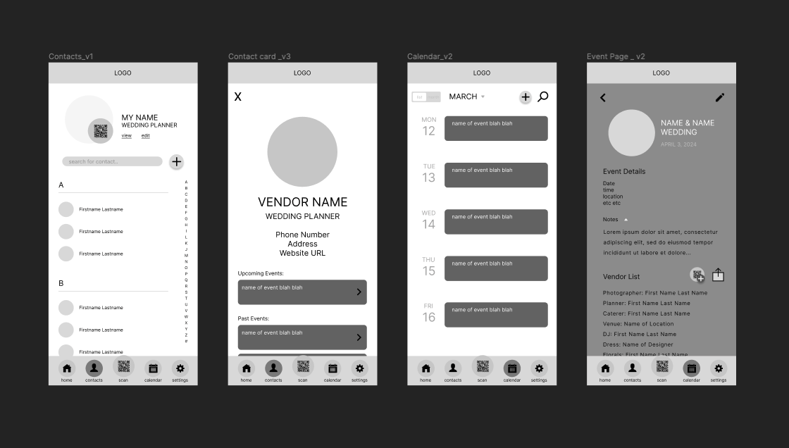
Once I had this information and structure established, I went through many iterations of sketches and wireframes to validate the selected user flows, ensuring my resulting high fidelity product would be ready to test with users.
Testing with Users & Analyzing the Results
After user testing a high fidelity prototype, I analyzed the results using a prioritization matrix to ensure that any final changes I made to the design resulted in the best possible user experience.
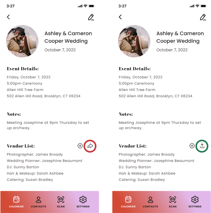
Many users expressed the ‘export’ icon was not immediately recognizable
User Feedback:
Swapping icons ensured the user was more easily able to identify the resulting function
How I Addressed It:
Many users expressed the plus and minus icons were not clear enough when supporting the ‘quick add’ to event function
User Feedback:
Swapping out the icons for a button and text label was more direct feedback for the user, outlining exactly what they were doing
How I Addressed It:
During user testing, some users expressed that the ‘contacts’ screens felt somewhat confusing as it relates to the function of the app. In other words, it felt like a phone; saving someone’s information so that you could call them at a later time. However, Vendeazie’s primary purpose is to simply catalog fellow vendor’s information for easy social media tagging, which led users to express this diconnect
What I learned:
Users expressed that the events were hard to scan because they were all the same color
While developing my product’s information architecture, I fell victim to the common trap of struggling to place the ‘dashboard’ within the system. I ultimately decided that a dashboard was not needed, and the calendar screens could successfully function as the user’s home base.
For V2, I would revisit common design patterns for saving and cataloging contacts, ensuring that my UI matches the user’s impression of the function of the app. I would also revisit copy decisions; would calling this feature something else solve the problem?
What I would do differently:
For V2, I would add a feature to ‘edit event’ where the user would associate a different color or icon for each wedding. I would user test each idea to determine which felt more intuitive and discoverable for my users.
After reflecting on these struggles, I determined that an open card sort would have been more beneficial than a closed one. The closed sort was too leading for the participants, and I would have been able to come to the conclusion that a dashboard was not needed much faster than I did initially.
Final High Fidelity Screens
Using Vendeazie’s existing data, research and user archetypes, as well as additional user interviews and qualitative research, I prioritized key features and designed thoughtful user flows and a fun and inviting user interface to support the user’s needs. The resulting designs have led to a continued partnership with Vendeazie as we plan to continue testing, iterating and exploring more features for their app.
The Outcomes
The Details..
Some screens in my design could benefit from headers or clearer signs to show the user where they are in the app
For V2, I would continue to explore common design patterns to determine where page headers are most effective and why they are used; as well as exploring other parts of my design that could be reevaluated for efficiency


